
|
Day 2-3: Example 2
|
| Total number of entries in the database: | 480 |
Gender Numbers
| Total number of males in the database: | 227 |
| Total number of females in the database: | 253 |
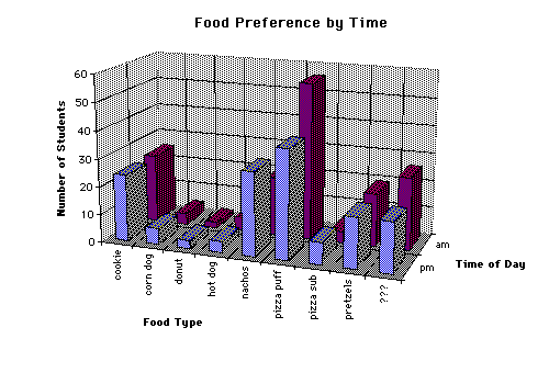
Food Information
| Total number who preferred cookies: | 64 |
| Total number who preferred corn dogs: | 10 |
| Total number who preferred donuts: | 10 |
| Total number who preferred hot dogs: | 17 |
| Total number who preferred nachos: | 73 |
| Total number who preferred pizza puffs: | 169 |
| Total number who preferred pizza subs: | 24 |
| Total number who preferred pretzels: | 50 |
| Total number who entered "???": | 63 |
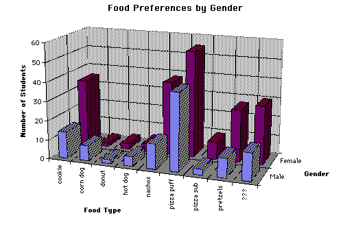
Chart of
the Preferences by Time at Davea
Download an interactive Excel file to create your own plots
An Excel spreadsheet has been specially created so that you can create your own plots based on the Davea food preferences data. There are only two things you need to know how to do.You can create 3-D plots (histograms) of food preferences versus gender, the time of day (AM and PM) or for 8 high schools. The first sheet in the Excel file allows you to choose between graphs of food preferences versus time or gender. To select which plot to create, simply click on the appropriate button. They look like this.

Excel will create a table of the appropriate data and the plot for the variable selected.
To create a plot of food preferences versus high schools, first click
on the sheet, "School". It is located at the bottom, left of the
screen. It looks like this.

A new sheet will appear with a button for each high school. (Those not listed are included in the variable "Other"). Click the high schools that you want to plot (maximum of 8) and then click the "Create Plot of Preferences by School" button.
Note: To create a new plot after one has been created, you need to
delete the other plot first. To do this, click on the plot to be erased
and hit delete.