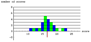

Notice the two verticle lines below the x-axis. The black line indicates the median and the red line indicates the mean.
Why is the mean different from the median?
Look what happens when we change the score of 11 to 16. If you downloaded the spreadsheet, change the numbers one at a time and note what happens to the mean and median with each change.
send comments and questions to Jay Hill