ANALYSIS AND CONCLUSIONS
The focuses of this section and analysis will be:
The component of the study to measure cognitive development during the instructional period was the achievement tests. The Algebra class and the Basic Mathematics class each showed an increase in achievement scores from the pre achievement test to the post achievement test. The results indicated that each class did attain knowledge about rate, and reading and interpreting information from graphs. Table 3 presents the number of students in each class that responded correctly to a greater number of items on the post achievement test, the number that responded to fewer and the number that responded correctly to the same number of items.
Table 3
Student Responses from the Posttest Compared to Pretest
|
|
|
|||
|
Correct responses were: |
|
|
|
|
|
|
|
|
|
|
|
|
|
|
|
|
|
|
|
|
|
|
|
|
|
|
|
|
The data in Table 3 suggest that the classes as a whole attained modest gains in knowledge about interpreting graphs and determining rates. Students in each class responded correctly to a greater number of items on the posttest. The classes had very few students that responded correctly to fewer items on the posttest than the pretest. The scores in each class suggest that more students responded correctly to a greater number of items after the instruction. This will be explained in a brief summary for each class in the next two sections.
The Basic Mathematics Results
The results from the basic students' responses to the ten-item achievement test indicate;
Table 4
Basic Mathematics Descriptive Statistics
|
|
|
|
|
N = |
|
|
|
Mean |
|
|
|
Median |
|
|
|
Mode |
|
|
|
Standard Deviation |
|
|
The mean was not the only measure of central tendency that increased. The median and mode also increased and tended toward four correct responses. The modal score is of interest to this study as it points to most students tending toward the mean. The mean, median, and mode all tended to center on four correct items on the posttest. This shows that not only did most students respond correctly to four items on the posttest the entire class tended to average toward four correct items.
Table 5
Basic Mathematics t-Test: µ (1 - 2), p=0.02
|
|
|
|
|
|
|
|
|
|
|
|
|
|
|
|
|
|
|
|
|
|
|
|
The p-value given (p = 0.02) suggests that the increase in mean scores was not due to chance but rather due to a difference in instructional methods.
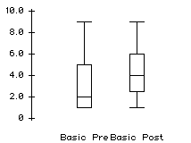
Figure 3. Boxplots of the basic math students' achievement scores.
The boxplots for the basic math students are included to illustrate a cluster of students around one to five correct responses moving upward toward three to five correct responses. The graphical representation implies that although the students did not perform as well as the algebra students they still performed well on the posttest compared to the initial responses.
Table 6
Frequency Breakdowns From the Basic Class (N=15)
|
|
|
|
|
|
|
|
|
|
|
|
|
|
|
|
|
|
|
|
|
|
|
|
|
|
|
|
|
|
|
|
|
|
|
|
|
|
|
|
|
|
|
|
Table 6 indicates that students who responded correctly to one or two items on the pre test became more distributed among one, two, three, and four items correct. This reflects the modal distribution movement from one item correct to four items correct.
Summary of Basic Math Achievement Results
The results suggest that the basic students did attain a significant increase in concepts measured by the achievement tests. The data are significant but how relevant? This study sought to introduce the concepts of rate and reading and interpreting graphs and measured the achievement and response to that introduction. These results are relevant as they suggest that the basic mathematics students and low performing students were able to learn the material explored during the technology-intensive instruction. These students frequently do not encounter graphing and certainly not graphing of this nature until much later in their academic careers. Introducing this concept now suggests that they may well be able to comprehend it at this level, despite a system of tracking them into lower-ability classes.
The Algebra Class Results
The results from the nineteen algebra students' responses to the ten-item achievement test indicate;
Table 7
Algebra Class Descriptive Statistics
|
|
|
|
|
N = |
|
|
|
Mean |
|
|
|
Median |
|
|
|
Mode |
|
|
|
Standard Deviation |
|
|
The mean, median, and mode all tended to center on ten correct items on the posttest. The algebra students performed very well as a whole on the achievement tests. This performance may also be due to previous experience with calculating distance from rate and time (D=R*T). In relation to the basic students these students should perform well as they had experience working with graphs prior to the instructional period and in essence the instruction during this study reinforced what they had already learned about distance, time, and rate.
Table 8
Algebra t-Test: µ(1 - 2 ), p=0.01
|
|
|
|
|
|
|
|
|
|
|
|
|
|
|
|
|
|
|
|
|
|
|
|
The statistically significant results suggest that the performance of the algebra students on the posttest was not the result of chance but rather resultant from the instructional period. This is especially relevant as they had been exposed to distance and rate calculation prior to the instruction but they had not explored them graphically.
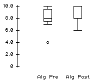
Figure 4. Boxplots of algebra students' achievement scores.
The boxplots illustrate the cluster of algebra students moving from 7 to 9 correct items to 8 to 10 correct items. One concern is that the test was limited to ten items. Had the test presented more items it would be intersting to see the level of correct responses. There was a ceiling to the amount of correct items the algebra students could respond to. Time constraints limited the amount of items included on each test.
Table 9
Frequency Breakdowns of Algebra Results
|
|
|
|
|
|
|
|
|
|
|
|
|
|
|
|
|
|
|
|
|
|
|
|
|
|
|
|
|
|
|
|
|
|
|
|
|
|
|
|
|
|
|
|
Relevant aspects about this table include the large amount of students responding correctly to eight or more items on the posttest compared to the absence of students responding correctly to less than six items.
Summary of Algebra Students' Achievement Results
These results indicate that some algebra students demonstrated significant gains in items measured by the achievement tests. The mean correct responses increased and more students responded correctly to more items on the posttest. It also indicates that the algebra students responded correctly to more items on each test than the basic math students did. These results suggest some conceptual development during the instructional period.
Summary of Achievement Results
All these data and results describe one aspect of this research. The students in each class did gain some conceptual knowledge about the ideas of rate and reading and interpreting graphs.
The differences between each class were evident as the basic students had not encountered graphs or distance formulae prior to the instructional period while the algebra students had encountered both but not together. The achievement results are relevant as they describe two classes of high and low performing students. Some students in each of these classes gained more knowledge about reading graphs and interpreting information from graphs.
Additional data were collected through surveys in order to develop a glimpse of the way that students felt toward mathematics and technology.
The students in each class responded to multiple choice surveys derived from instruments administered in the Second International Mathematics Study. The percentage of students responding favorably to each item is reported. The favorable (or positive) responses are included to create a picture of students gaining a more positive attitude (desirable in this research) toward mathematics, their mathematics experiences, and technology, (specifically calculators) in the mathematics classroom. This is true for items that are worded in a reverse fashion (negatively) as well. An example follows.
Example Item: "I think this report is ridiculously inane." Note: not used on the survey.
Response Pre: Strongly agree.
Response Post: Disagree.
The desired response is disagree since this report is not inane (positive is disagreement). Since the response moved from strongly agree to disagree this would be a more favorable response.
The responses were coded from a Likert scale of 1 to 5 for "strongly agree" to "strongly disagree" with 3 as an "undecided" response. Then a count for each response was performed for each item. An example is shown with a count (out of 100) for each response.
Example Item: "I think this report is ridiculously inane." Note: not used on the survey.
Count of 1 (strongly agree): 33 Pre, 12 Post
Count of 2 (agree): 2 Pre, 0 Post
Count of 3 (undecided): 35 Pre, 35 Post
Count of 4 (disagree): 20 Pre, 23 Post
Count of 5 (strongly disagree): 10 Pre, 30 Post
Using this example, there are 35% responding in an unfavorable manner (combining the "agree" and "strongly agree" categories) on the pre and 33% responding favorably ("disagree" and "strongly disagree") on the post. Then there are 12% responding unfavorably on the post and 53% responding in a favorable manner on the post. This indicates an increase in favorable responses and suggests that the report was viewed favorably after the survey period. The direction of change was positive on this example item with an increase of +20.
A direction of change was calculated by subtracting the pre survey percentage from the post to determine the direction of change in the students' responses. The aforementioned example an item with a negative change suggests that a smaller portion of responses was positive or favorable after the instructional period. The opposite was true if an item was shown to have a positive change from the pre to the post. Specific items of interest were selected with a definite change in attitudes measured by a large change (negative or positive). The complete responses for both classes are in Appendices D, and E.
Basic Mathematics Survey Results
The basic mathematics students' surveys indicated that a large percentage of them responded favorably to most items on the pre test. This suggests that students felt positive attitudes toward the particular items. The students also expressed positive responses to the same items on the posttest, most often indicating an increase in positive attitudes. This is interesting as it provides evidence that students in the basic class may have already identified with the mathematics they were learning. It is also interesting to note that nearly all of the responses increased positively from the pre to the post.
The basic math students indicated an increase in favorable responses toward several survey items after the instructional period (Table 10).
Table 10
Basic Math Students Increase in Favorable Responses (N=15)
|
|
|
|
|
|
How do you feel about using charts and graphs in mathematics? (IMPORTANCE) |
|
|
|
|
How do you feel about using charts and graphs in mathematics? (EASE) |
|
|
|
|
How do you feel about using charts and graphs in mathematics? (LIKE) |
|
|
|
|
How do you feel about using a hand-held calculator in mathematics? (IMPORTANCE) |
|
|
|
|
How do you feel about using a hand-held calculator in mathematics? (EASE) |
|
|
|
|
How do you feel about using a hand-held calculator in mathematics? (LIKE) |
|
|
|
|
Solving Word Problems is more fun if you use a hand-held calculator |
|
|
|
|
I think Mathematics is fun |
|
|
|
|
Learning mathematics involves mostly memorizing |
|
|
|
|
I like to help others in mathematics problems. |
|
|
|
|
Mathematics is useful in solving everyday problems |
|
|
|
|
Using a hand held calculator can help you learn many different mathematical topics |
|
|
|
Table 10 displays some interesting trends in student responses to the survey items. A larger percentage of basic students considered graphs to be more important, easy, and likable after the instructional period. About twenty percent of the students thought mathematics was more fun and they liked working with others more after the instruction. The students also responded more favorably toward items pertaining to calculator usage in the mathematics classroom after the instructional period.
The students responded more favorably toward most of the survey items. There were some items that the students responded less favorably toward after instruction. (Table 11).
Table 11
Basic Math Students Decrease in Favorable Responses (N=15)
|
|
|
|
|
|
I can get along well in everyday life without mathematics. |
|
|
|
|
Mathematics is not needed in everyday living |
|
|
|
|
It is less fun to learn mathematics if you use a calculator |
|
|
|
Table 11 displays three items that the basic students responded to less favorably on the posttest. This may have been due confusion resulting from the negative wording that all of these items contain. Each of the items in Table 11 did have a large percentage of favorable responses on each survey (greater than 60%). This indicates that although the favorable responses to these items decreased, much more than half the students responded favorably.
The cluster of students in the boxplots in Figure 5 suggest that more than half of the students responded more favorably to survey items on the post survey (Outliers are circles).
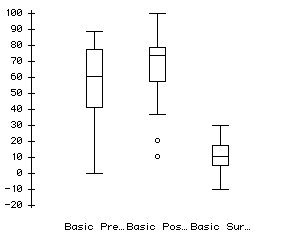
Figure 5. Boxplots of basic students' favorable survey responses.
Figure 5 depicts the cluster of favorable responses ranging from 0 % to 90 % for particular items on the pre survey. The post survey depicts a more compact range of 40% to 100% favorable responses for items with a few students responding less favorably. The tightening of this range within higher percentages suggest the students had gained some positive attitudes toward the survey items.
Summary of Basic Math Survey Results
The basic math students responded favorably for most of the items on the pre and post surveys. This is evidence that they did not have many negative attitudes toward mathematics prior to the instruction and it suggests that their positive attitudes may have been reinforced by the instructional period. There are limitations to consider in this type of instrumentation and these might be evident in the responses to positive items worded in a negative manner. However, the results from these surveys do shed some light on the way students are thinking about their mathematics experiences.
Algebra Survey Results
The algebra students' surveys indicated that a percentage of them responded favorably to some items on the pre test. This suggests that students felt positive attitudes toward the particular items. Table 12 displays the items that algebra students responded positively toward on the pre and post surveys.
Table 12
Algebra Students Increase in Favorable Responses (N=19)
|
|
|
|
|
|
How do you feel about using charts and graphs in mathematics? (EASE) |
|
|
|
|
How do you feel about using a hand-held calculator in mathematics? (EASE) |
|
|
|
|
How do you feel about using a hand-held calculator in mathematics? (LIKE) |
|
|
|
|
I can get along well in everyday life without mathematics. |
|
|
|
|
Using a hand held calculator can help you learn many different mathematical topics |
|
|
|
|
Mathematics is useful in solving everyday problems |
|
|
|
The algebra students responded favorably toward items that indicated they had some positive experiences with the introduction of the technology. They did not however respond remarkably favorably toward many of the other items. There were few items indicating a large movement of students indicating more favorable responses. The algebra students did however indicate clearly less favorable responses on a number of items. A table displaying items indicating a clear trend of fewer students responding favorably in included in Table 16.
Table 13
Algebra Students Decrease in Favorable Responses (N=19)
|
|
|
|
|
|
I think Mathematics is fun |
|
|
|
|
I really want to do well in mathematics |
|
|
|
|
Learning mathematics involves mostly memorizing |
|
|
|
|
I like to help others in mathematics problems. |
|
|
|
|
It is less fun to learn mathematics if you use a calculator |
|
|
|
Table 13 presents an interesting collection of responses from the algebra students indicating less favorable attitudes toward items that pertain to their mathematics experiences including helping others, having fun in math, and finding relevance of math. This is interesting to note because although most students in the algebra class felt favorable toward these items the items still display a tendency toward less favorable responses by some students. The boxplots below indicate the clusters of students for each survey.
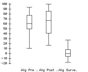
Figure 6. Boxplots of algebra students' favorable survey responses.
The algebra students' responses tended to be distributed across more responses on the post survey. This suggests evidence that the algebra students were not as confident or sure of their positive feelings toward mathematics after the instructional period.
Summary of Algebra Survey Results
The algebra students responded favorably for most of the items on the pre and post surveys. This is evidence that they did not have many negative attitudes toward mathematics prior to the instruction and it suggests that their positive attitudes may have been reinforced by the instructional period. It is interesting to note that although most students responded favorably there were a percentage of students whose responses were less favorable on the posttest. The cluster of students responding favorably broadened including more and less favorable responses.
The algebra students were used to a set routine and established success within their mathematics class and this type of instruction may have disrupted that routine.
Conclusions from Survey Results
Most students did indicate favorable responses to items on the pre survey and more favorable responses to items on the post survey. These were items dealing with technology in mathematics, relevance of mathematics beyond the classroom, and their views of mathematics. However, the differences that are apparent between the responses of the two classes are important to develop the different ways that these classes view themselves in their mathematics classrooms, how they identify with mathematics, and how the instructional period affected their attitudes toward these items. Some students in the algebra class had a difficult time navigating the freedom of the classroom organization and working cooperatively. While this may be a commentary for how higher ability groups are tracked that is not as interesting as the indication that the basic mathematics class seemed to enjoy this type of instruction more and indicate better descriptions of themselves in mathematics after being involved with this type of instruction. The students in the algebra class encountered technical difficulties that may explain the attitudes toward the instructional period as not very much fun. The basic students used the instructor as more of a facilitator that would fix the problem so they could keep experimenting. The results indicate that the students experienced a beneficial instructional period despite a few difficult periods and the basic mathematics students responded more favorably on several items than did the algebra students indicating more satisfaction with the instructional period compared to their typical instruction.
The quantitative data above represent significant achievements for some students in each class and the survey responses indicate considerable increases in positive responses toward mathematics and mathematics instruction. However, I encountered considerable difficulty in establishing the relationship between these data and detailing the experiences the students actually had. I also collected data through videotapes and interviews and field observations. I believe that several snapshots of this data will portray much more vivid examples of students actively participating, solving problems, experimenting with ideas, and interacting with the instructor and each other. These snapshots will reveal much more detail about the technology-intensive instruction and the experiences the students had within that period.
The next section presents snapshots of the students' participation in the classroom activities collected through field notes and videotapes. These snapshots point to clear observations of high performing and low performing students exploring mathematical concepts and making discoveries in a technology-intensive setting. Low and high performing students depicted in these snapshots will exhibit evidence that they;
I noticed the students in each class discovering and exploring new ideas and concepts associated with graphs and graph interpretation. Following each snapshot is a brief description of how that snapshot is relevant to this study.
Snapshot 1
Students in each class initially choreographed a volunteer creating a graph on the overhead display. Students choreographed, or directed, the volunteer walker in ways that suggested their view of the graph as a picture or map. This was evidence of the initial conceptions and misconceptions that students had prior to the instructional period.
Common directions from the classroom choreographers are presented:
"Go side to side!" "Go in a circle!" "Spin!"
"Jump up and down!"
"Go toward the thing."
"Run and then stop!"
"Run," "Now go back"
"Stop!" "Go!"
The first few commands to the walker will display graphs on the calculator, however they are different from the choreographer's intentions. The walker's distance from the sensor is measured and graphed. However, most students assume that as the walker jumps they will see a graph that goes upward rapidly. Another common misconception of this type is the misconception that placing the sensor on a stair and then walking down and away will produce a step-like graph. This is not the case and the students soon realized that this is not true through experimentation. They also attempted to make circular graphs by telling the walker to spin or go in a circle. This is also a misconception, that the sensor detects your actual physical movement and not your distance from the sensor at particular points. Students then noticed this was not working as they originally thought and sought to modify the graph in other ways by directing the walker to run and stop.
The students were actively involved in the dynamic graph construction through these initial experiments. This is relevant to this research because students in each class began to understand what is being graphed and how the sensor was graphing it. Scenarios enacted during the periods of exploration showed students who were wrestling with the misconceptions described earlier from Mevarech, 1997; and Fernandez, 1998. This was evident in the volunteers and in classroom choreographers. The cooperative and active choreographers and walkers were quite different from what I had expected as per the classroom instructor's descriptions of the basic students as low performing, and nonparticipating students and the algebra students as nonparticipating and resistant to open-ended instruction.
Snapshot 2
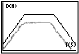
Students working with the "match-the-graph" activity cooperated within their groups to create the best possible match for a given graph. An example of this type of graph and an attempt to match it is included in Figure 7.
Figure 7. Match the graph example.
Student participation and exploration was evident in every group. This was noticed in each class and an example of dialogoue is included to provide evidence that there was group participation and cooperation toward creating the graphs to match a given graph. Groups had designated particular roles for individuals and these roles were consistently rotated to provide all members with access to particular aspects of the experiments.
"You walk"
"You tell them when to go"
"You stand there so they know where to turn around"
"You count out the seconds."
"You hit the button."
This allowed for the greatest number of students to have access to directing graph creation as groups members shouted directions putting the onus on them to learn that particular movements and specific directions (those who shout them, and those who follow them) are crucial to developing accurate graphs.
Snapshot 3
Michael was a student in the basic mathematics class who usually sat in the back and read other materials instead of participating and he was frequently characterized as a low performing student by the classroom instructor. During the instructional period he seemed to enjoy the calculator equipment a great deal and attempted to describe to his group members and sometimes to nobody in particular what was going on. I caught Michael in a moment of agony on one of the initial days. I say agony because he literally seemed to be in pain trying to figure something out. I asked him what was going on. He was trying to clarify in his head and explain to the group (at the same time) that moving away from the motion detector meant the graph was going up and coming back toward it meant the graph was going down. This is a correct interpretation, but he was not settled until he could not explain it because several attempts to test this theory resulted in more confusion. He searched frantically for some chalk and then he came up with this picture on the board (Figure 8). His group listened attentively then they tried to test his hypothesis.
= moving away from the motion sensor
and
= back toward the sensor
Figure 8. Michael's chalkboard explanation.
This was relevant as an example of the potential for learning that calculators may help reach in students, particularly students like Michael who, prior to the technology intensive instructional period, receded into their own secluded thinking during math class. The classroom instructor remarked at Michael’s eagerness to explain his theory, and I marveled his persistence to overcome the internal struggle he was having while trying to visualize this event and explain it. Then of course, his group wanted to make sure, so they tried it out often and eventually were convinced of Michael’s conclusion.
Snapshot 4
Groups frequently used physical markers in the classroom to designate starting points and ending points of particular intervals they were trying to match. They also used real-time counts of their own to decide when a walker should turn, stop, or speed up as dictated by the graph they were trying to match. They matched these physical measures with the electronic measures on the graph to produce accurately matched graphs. This was especially common in the algebra class.
Some groups measured off meters and used tape or books to establish where on the floor the walker should turn or start or stop. They frequently counted seconds out or made sure that the walker understood that when
"My hand goes to three and you turn around and come back toward us." Or "I’ll count the seconds out and she’ll give you directions, O.K.?"
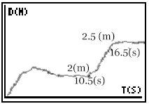
The algebra students also frequently decided that they did not have enough room to match a particular graph exactly but instead they opted to create a reasonable match of the shape within the physical distance that they were allowed as in the example shown in Figure 9.
Figure 9. Close-enough match to a graph.
Notice that the graph is about 0.5 meters short throughout each interval but the shape is similar so the action performed is similar. This is relevant as students established the connection between the physical environment of the classroom as related to the graphical representation of the walker's movement. This is no small leap in understanding as it requires transferring the units measured by the technology devices to units measured on the floor or otherwise physically. These scenarios are relevant in that they depict students discovering novel methods for:
a.) Navigating the physical arrangement of the classroom to create optimal graphs to interpret.
b.) Cooperating with group members and other groups to coordinate space and complete activities.
Snapshot 5
There are several "big ideas" that emerge in graphing activities describing real events. These "big ideas" are crucial to mathematics learning from the time slope is introduced through calculus.
How do eighth grade students approach these situations? What do they conclude from these situations or scenarios? Should these "big ideas" even be considered at the middle school level? The students in this study encountered these big ideas and approached them with curiosity, questions, and experimentation. In the first case, most students noticed that a horizontal line is produced when the walker has stopped for an extended period of time. Asked to explain this phenomenon they describe what seems natural to them. As Michael (a low performing student) simply put it
"You are standing still, you are not moving but time is expiring. It’s like a rest or something."
Or as Kent (a high performing algebra student) said:
"You are staying at a constant distance from the detector that creates the graph and that
creates a flat line."
This is a crucial concept to understanding graphs, that a horizontal line denotes no change in y (x = anything) while x changes continuously (x = changing). Notice that this comment is evident and similar in both the basic math student and algebra student. Nearly every student clearly stated this after they had attempted it with the sensor and calculator an example is shown in figure .
Figure 10. Example of a horizontal segment with no slope.
The second case, a vertical line with a slope that is undefined and tends toward infinity, was a bit trickier but no less interesting and no less indicative of the curiosity of the students in these two classes. A vertical line is "impossible" I heard many of them say. Why it was impossible, was not as easily answered until the students had tried it enough and failed to make a vertical line. Students in each class tried everything they could think of. They ran really fast, they jumped, or they used additional props. The first two seem natural enough as the students recognized and wanted to cover a large amount of distance in very little time. The discovery of the futility of trying to make a vertical line is summarized:
"You can’t possibly move that fast and you can't cover that distance in no time"
A very big idea is evident here that the students recognize the relationship between covering a large distance in little-or-no-time. This was evident in each classroom of students.
Additionally, some students in each class attempted to produce a vertical line through "cheating" with props. They accepted the fact that running to produce a vertical graph would not work. They also realized that the vertical line had to be made with something that moved quickly in an out of the sensor's beam. Some students attempted to move a chair quickly in-and-out of the sensor's beam, moved a book quickly in and out of the range, or jumped quickly in and out. The students realized that they had to trick the sensor into thinking they had moved a large amount of distance in very little time. An example is shown in Figure 11.
Figure 11. Student example of a graph made by "cheating".
The third component of students discovering "big ideas" were the big ideas from dips and peaks in the graphs and describing the behavior of the walker during the peak or dip. This is another "big idea" because it involves identifying the peak as a point where the person pauses, the graph changes, and there is a brief moment where change in y is zero. Examples are shown in Figure 12.
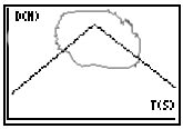
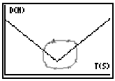
Figure 12. A peak and a dip in the graphs.
One student in the basic math class explained:
"That little point at the top is really a little straight line."
Algebra students quickly recognized that the walker pauses briefly and then "turns around to come back toward the sensor".
This is a big idea and relates to a misconception that some students encounter with these type of graphs. Some students when interpreting the graphs will say that the graph is actually a peak or a point where some jumps or is somehow otherwise up higher. The point represents a stop and transition from one direction to the other direction.
Snapshot 6
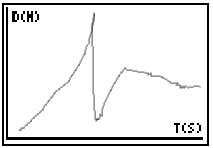
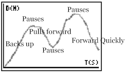
This snapshot is very interesting as a female student in the basic mathematics class made it. She decided and explained to the group that this graph (Figure 13) is made by a woman pulling out of a parallel parking spot.
Figure 13. Basic Math class example graph of a parallel parking experience.
I was deeply interested. I believe "Huh?" was the first word out of my mouth. I had not noticed it but then she explained it to me. She explained her reasoning to the group and once the group agreed they presented it to the class.
"The woman backs up for a few feet. She then pauses, switches into drive, and pulls forward for about half the distance. Then she pauses again and backs up a few more feet and then she pauses again and pulls all the way out and drives off."
Figure 14. Group explanation of the parallel parking graph.
This was a very adept demonstration of the students' ability to transfer the graphs of meters vs. seconds to feet vs. minutes. When prompted the students gave rough estimates of where the car was in terms of the other car and how much time had passed (i.e. a few feet away, a few minutes). They did indicate that the car was going slowly and at a constant pace for each of the intervals of movement. They enacted the creation of this graph and the group members all worked together to describe what was happening as they presented this to the class.
This was relevant because afterward the classroom instructor said that the girl who came up with this usually sleeps during class and was described as a low performing student. This activity gave her the opportunity to gain confidence in explaining the ideas she discovered using the technology. This experience is important in relation to Dunham's research (1995) on confidence and spatial ability in females with the use of graphing equipment.
Snapshot 7
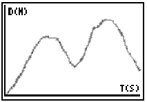
Ashley was also described as a low performing student. Ashley described a very specific scenario that she discovered after one of the early days of instruction. She describes her bus trip to the school every morning.
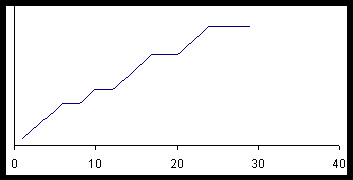
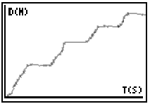
Figure 15: Ashley's self-generated graphs.
These graphs represent another important transfer to real life events from the events in the classroom. One day during instruction she drew the top graph to represent an experience she had that could be graphed and I asked her what she was drawing. She described very clearly what each interval meant (stopping the bus and picking someone up). She named who was picked up and for the first interval she described that was her turn. She described the last interval as everyone unloading from the bus.
I thought this was remarkable as she was quiet and the classroom teacher described her as one of the low performing students in the classroom. The second graph shows her group’s attempts with her direction to create the same graph with the distance sensor and calculator.
She described the math as being relevant to her life by describing her experience with the bus route graph as relevant. Ashley made it clear that she did use this knowledge with other experiences beyond the classroom.
"When we talked about the one with the bus and the stops. I think about the bus like a graph."
This snapshot is relevant to this research as it presents a low performing student in the basic math class comprehending and explaining how she transferred the ideas explored during the instructional period to a situation outside the classroom.
Snapshot 8
The algebra students were better at determining the specific speed over an interval. This was likely because they had experience with graphs prior to the instruction and they had determined slope with specific discrete endpoints on an interval. The example in Figure 15 shows an example of an algebra student determining speed from an interval.
![]()
Figure 16. Algebra student example of determining speed over an interval.
This snapshot is relevant as it details the algebra students' attempts to calculate the speed over a certain interval by using the trace button on the calculator. They would trace the endpoints of an interval to find the most useful points and then use those points in a typical slope calculation to determine speed over that interval or change in y over change in x. Most of the algebra students were able to get this far. Difficulty arose when attempting to distinguish between extraneous blips on the graph from actual points on the interval. This suggested that most students recognized the necessity for defining clear end points on the interval to determine average speed over that interval.
Summary of Snapshots
These snapshots are interesting from the perspective of conceptual development as students wrestled with concepts and explained them to one another and the instructor. They are also interesting from the perspective of student engagement. These snapshots help describe the experiences that these students had and the type of dynamic learning the students were engaged in. Students were involved in participating, cooperating, and experimenting throughout the instruction and explaining their results throughout. This suggests that the basic mathematics students might well be able to comprehend concepts such as graphing and determining information from the graphs instead of routine arithmetic problem sets and calculating percentages. These snapshots help explain some results driven by the original questions of this study.
Each day during this instructional period the students in both classes were engaged in learning mathematical ideas related to rate, and reading and interpreting information from graphs. These topics were explored in technology, collaboration, and experimentation environments. Students in both classes demonstrated positive attitudes using technology to learn mathematics and more positive attitudes toward their mathematics experiences as suggested by the surveys and classroom observations.
Some students began to identify with the mathematics as suggested by classroom observations that showed increased ability to engage in experimentation and negotiation of ideas. Some students in each class also demonstrated that they are able to identify with the mathematics they were learning in relation to the world outside their classroom. Students in each class that had previously not participated in discussions were openly presenting ideas and ways they would use these ideas. These observations suggest the potential that technology-intensive instruction has to engage more students in learning mathematics. This is important to consider and is related to the NCTM proposal: that all students can learn mathematics. If newer students are given opportunities to learn mathematics in this way then we are closer to helping all students learn mathematics. Many students in these classes demonstrated abilities to communicate, reason, connect, and explore problems during the instructional period as suggested by the classroom observations. The results from the observations seem to be consistent with what other researchers have found in graphing calculator studies. Some students in each class seemed to display a better attitude toward mathematics and a better self-concept in mathematics (Hembree and Dessart, 1986, Dunham, 1995).
Students were engaged and the technology appeared to provide a dynamic learning environment. This type of dynamic learning environment presents a different mode for the instructor to interact with the students within.
In studies where graphing technology was in use, students were more active and they participated in more group work, investigations, problem solving, and explorations. Teachers lectured less and were often used as more of a consultant or facilitator than task setter. (Dunham, 1993, Dunham & Dick, 1994, p.43)
The students in this project seemed to benefit from the new environment and relationship that existed between them and the instructor.
The instructor was not presenting the answers to the students and acting as the vessel of knowledge but merely facilitating their interaction and exploration with the mathematics and the equipment. Students explored and developed ideas through experimentation and exploration with the technology in ways similar to scientists (Devitt, 1997). This exploration and new level of experimentation appeared in each class, which suggests that the basic students are capable of learning more complex mathematics.
Some students demonstrated sophisticated knowledge about the concepts covered and participated actively in the activities. Several of these students were chosen for case study explorations. It is relevant to discuss and look at specific students who represent different cases of low and high performing students in each class.